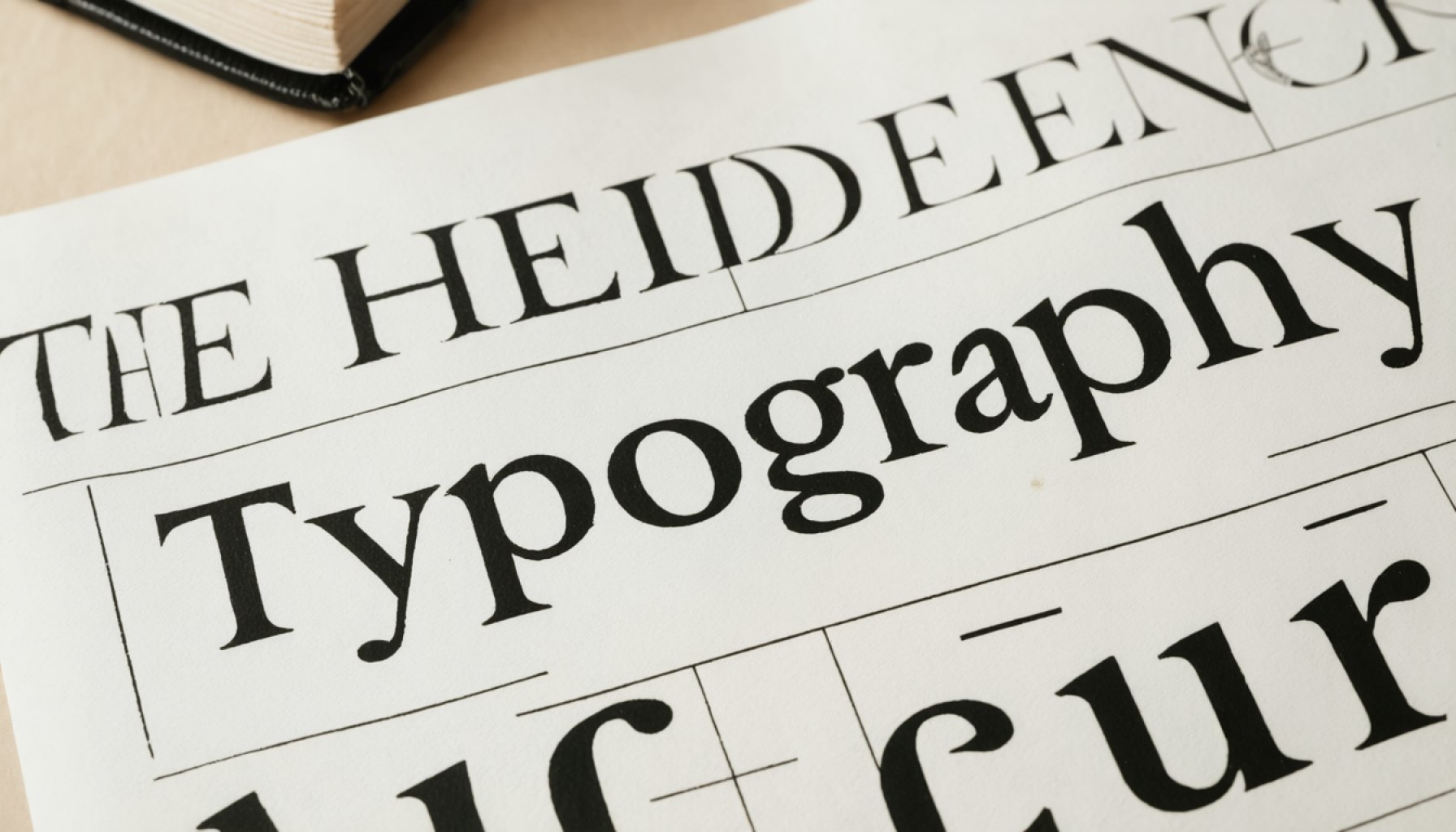
- Typography influences our digital interactions profoundly, affecting how we perceive and engage with content.
- Typography decisions, such as font size and style, guide reading experiences and emotional responses.
- The choice between serif and sans-serif can impact user engagement and attention.
- Typography communicates emotion and tone; for instance, bold fonts can convey urgency, while softer fonts suggest calmness.
- Effective typography enhances brand trust and authority in the digital space.
- Layout and structure around typography are crucial for clarity and user confidence.
- Understanding typography’s psychological impact is vital for creating engaging online experiences.
- Prioritizing intentional typography can significantly boost user engagement in digital platforms.
Typography, the visual dance of letters and words, shapes our interaction with the digital world more profoundly than we might think. Often overlooked, these silent heroes of content delivery guide our eyes, influence our emotions, and can even dictate how absorbed we become in the information presented to us.
Consider this: every time you check your phone or scroll through a web page, the typography crafts your reading journey. The size of the fonts, the spacing between lines, and the distinct style of the letters all work together to create a rhythm that either beckons your attention or sends you wandering. The seemingly mundane decision between a serif or sans-serif typeface holds the power to either lull you into deep engagement or hastily nudge you away.
More than mere aesthetics, typography’s effectiveness lies in its ability to communicate the intended emotion and tone of a message. A bold and angular typeface might scream urgency and alertness, while a gentle, rounded script whispers serenity and calm. Effective use of these elements becomes crucial when brands and businesses aim to build trust and convey authority in the virtual marketplace.
Yet, it’s not just about how words look. The layout and structure around these words play an equally pivotal role. A cluttered webpage with haphazard typography signals chaos, whereas a well-structured interface with thoughtful typographic choices instills confidence and ensures clarity.
As digital interactions dominate our daily routines, understanding the psychological nuances of typography becomes essential. For anyone crafting an online experience—be it websites, apps, or digital advertising—the key takeaway is clear: prioritize typography. Craft it intentionally, and watch as user engagement levels soar.
In this ever-evolving digital landscape, where pixels replace paper, remember that behind every click, scroll, and linger is a narrative shaped as much by the words themselves as by the artistry of those who bring them to life.
The Hidden Power of Typography: How Fonts Shape Our Digital World
Understanding Typography’s Role in Digital Design
Typography is more than just a design element; it is a powerful tool that shapes how we perceive and interact with digital content. While often overlooked, the choice of fonts and their arrangement significantly impact readability, emotional response, and overall user engagement.
Key Facts About Typography’s Influence
1. Psychological Impact: Typography greatly affects how users perceive a brand or piece of content. For instance, serif fonts are traditionally associated with respectability and tradition, making them suitable for formal documents or institutions. In contrast, sans-serif fonts are seen as modern and clean, often used for digital interfaces to enhance readability on screens.
2. Readability and Accessibility: Font choice and size directly influence readability. For digital content, it’s crucial to maintain a balance between style and functionality. Larger font sizes and sufficient line spacing improve readability for all users, including those with visual impairments.
3. Emotion and Tone: Just like color psychology, typography conveys emotions. Fonts like Comic Sans are perceived as casual and informal, whereas Helvetica is considered neutral and professional. Choose typography aligning with the message’s tone and the brand’s personality.
How-To: Choosing the Right Typography for Your Project
1. Define the Purpose: Understand the core message and the audience. The typography should align with both to effectively convey the intended message.
2. Consider the Medium: Different devices and platforms have varying requirements. For example, web designs need responsive typography that adapts to different screen sizes.
3. Test Readability: Always test the selected typeface for readability. Use tools to ensure contrast between text and background and check usability across devices.
Real-World Applications and Trends
– E-commerce Websites: Typography can significantly influence user trust and conversion rates. Clear and professional fonts help strengthen brand credibility.
– Educational Platforms: Accessible and readable typography is crucial to ensure learners are not distracted and can easily assimilate information.
Pros and Cons Overview
Pros:
– Enhances brand recognition and conveys professionalism.
– Improves user experience by making content easier to read.
– Can express the brand’s identity and evoke specific emotions.
Cons:
– Poorly chosen typography can hinder readability and reduce engagement.
– Some unique fonts may not render well across all devices and browsers.
Emerging Trends and Industry Insights
– Variable Fonts: These provide flexibility in style variations, reducing the need to download multiple font files, leading to faster load times.
– Microtypography: Attention to small typographic details, like kerning and ligatures, is becoming increasingly important in high-end design projects.
Conclusion: Actionable Tips
– Prioritize readability and accessibility when selecting typography for digital projects.
– Regularly update and optimize font choices based on design trends and audience feedback.
– Utilize tools like Google Fonts for diverse and web-safe font options.
For more insights into creating effective digital content, consider exploring resources on typography and design best practices. A starting point can be Behance for inspirational designs and trends.


